
Magazine › Interiors
Designing for Clarity: How Indian Homes Benefit from Intentional Spatial Hierarchy
Intentional design hierarchy—clear sightlines, purposeful thresholds, legible materials—transforms how residents navigate and inhabit their spaces. Discover the principle reshaping premium Indian interiors.
By the Ander Baher Editorial Desk · 24 October 2026
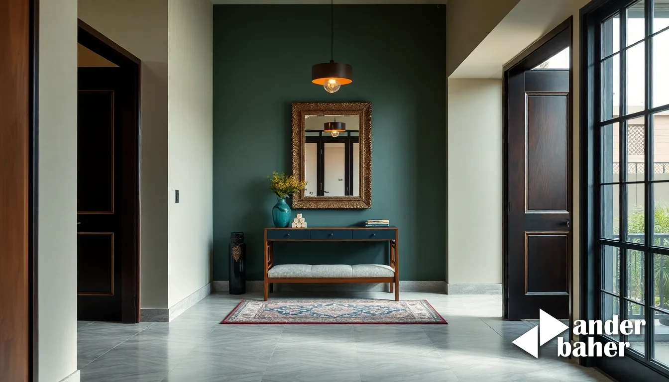
The best interiors don't demand attention—they guide it. A thoughtfully designed threshold, a shift in materiality, a sudden widening of breath: these quiet gestures orchestrate how you move through a home, how light lands, where your eye naturally settles. In the language of spatial design, this is hierarchy—not ornament or spectacle, but the careful ordering of information so that a space reads as composed, legible, alive.
This principle has long been the backbone of masterful architecture and interiors worldwide. Yet in the context of newly-possessed high-rises in Bengaluru—from the glass-walled towers rising over Sarjapur Road to the compact units handed over in Whitefield developments—and in the older, layered buildings of Mumbai's established enclaves, clarity often gets buried beneath builder-vanilla finishes, orphaned fixtures and material chaos. The result: spaces that feel busy rather than ordered, chaotic rather than calm.
Why Spatial Hierarchy Matters in Indian Apartments
Hierarchy isn't decoration. It's the invisible architecture that makes a space feel either like a series of unrelated rooms or a coherent whole. In a newly-handed-over unit in Domlur or Powai, this clarity becomes essential: most owners inherit open-plan layouts with minimal visual anchoring. A living zone bleeds into a bedroom; the kitchen becomes a visual afterthought. Without intentional hierarchy—a carefully placed partition, a material boundary, a shift in floor level—the interior reads as chaos.
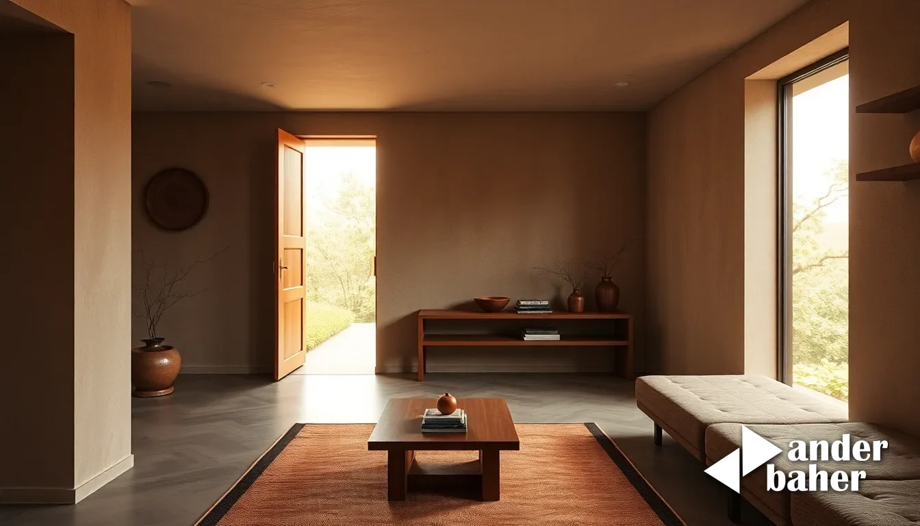
Intentional spatial hierarchy solves this by establishing a visual and experiential logic. You enter a threshold and know, instantly, where you are. Materials shift to signal transition—terrazzo to timber, concrete to stone. Light is orchestrated so that primary zones feel grounded and secondary spaces recede naturally. This isn't about walls; it's about reading the space correctly.
For the owner of a newly-completed tower in Thanisandra or a pre-owned apartment in Bandra East wrestling with outdated layouts, this principle becomes a design contract: every surface, every edge, every threshold earns its place by clarifying spatial intent.
Material Language as Wayfinding
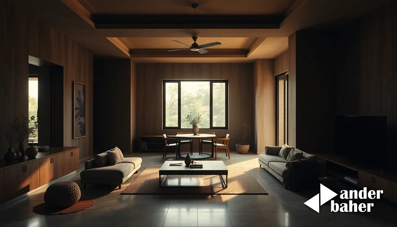
Walk through a thoughtfully designed interior and you'll notice that materiality isn't random. A polished concrete flooring in the entry suggests arrival and pause. Warm timber in the living zone invites lingering. A matte-finish plaster or jali screen in the sleeping quarters signals retreat. These material shifts are a form of wayfinding—they tell your body where it is and what to expect.
In the context of monsoon-prone climates and the intense seasonal light of Indian summers, material clarity also performs a practical function. A threshold material that visibly drains water signals durability to the eye. Jali screens that filter afternoon sun without diffusing it speak to climatic intelligence. Stone flooring that reads as unified across zones (despite subtle slope changes for drainage) creates visual calm while solving technical problems invisibly.
This is where our integrated interior and landscape practice becomes essential. An interior threshold isn't complete without considering the balcony or garden beyond it—the material language must flow from indoors through to the external edge. A timber-and-stone palette inside demands continuity outside; a water line that's invisible inside becomes legible in the landscape.
How to Read (and Build) Hierarchical Space in Your Home
Clarity begins with a single question: What is the primary experience of this room, and how do I signal it immediately?
In a living room in a just-completed Whitefield development, the answer might be: gathering and light. A generous sofa zone anchored by a unified flooring material, with secondary zones (work nook, reading corner) set apart by subtle material or level shifts. The eye enters and knows, instantly, where the heart of the room lives.
In a Mumbai renovation—say, a pre-owned flat in Lower Parel or Altamount Road—clarity often requires subtraction before addition. Removing visual clutter (orphaned fixtures, competing materials, fractured ceiling heights) restores legibility. Then, selective material boundaries reintroduce intentional complexity: a plaster feature wall that grounds a social zone, a timber partition that defines a threshold without closing it off entirely.
The principle holds whether you're working with 1,200 square feet or 3,000. Space isn't about size; it's about being read correctly.
Threshold Design: Where Hierarchy Becomes Tactile
A threshold is where hierarchy becomes physical. In a Bengaluru high-rise off Sarjapura Road, the threshold from entry to living often carries enormous design weight: it's the first place your eye lands, the moment the interior reveals itself. A well-designed threshold doesn't announce itself loudly; it orchestrates a subtle shift—a material change, a light modulation, a momentary narrowing that opens into generosity.
For apartments facing monsoon challenges (common in older Mumbai buildings or newer constructions dealing with balcony dampness), the threshold becomes technically critical too. A slightly raised material edge, a hidden slope, a drainage-conscious detailing—these solve real problems while maintaining visual harmony.
The most elegant thresholds feel almost inevitable, as if the space naturally organized itself this way. This is the goal: clarity so complete that it feels like it cost nothing, when in fact it required disciplined intent.
Bringing It Together: The Coherent Interior
A coherent interior is one where every gesture—a material choice, a partition, a lighting strategy, a landscape threshold—speaks the same language. The owner of a newly-handed-over unit faces an opportunity: to start from an architect's shell and compose something legible from first principles. The renovator faces a puzzle: to restore clarity to spaces that have accumulated visual noise.
Both can benefit from the same foundational question: What is this space for, and how do I make that purpose instantly readable?
When hierarchy is clear, a home doesn't feel like a collection of disconnected rooms. It feels like a single, coherent thought—one expressed through material, light, threshold and proportion. You move through it with ease. You rest where you're meant to rest. You know, always, where you are.
This is the quiet power of intentional design. It doesn't shout. It clarifies. And in the context of Indian homes—where space is often compact, light intense, and seasons dramatic—that clarity becomes both an aesthetic and a practical gift. Explore our delivered spaces to see how spatial hierarchy reshapes inhabited reality, or get AI conceptual designs for your own threshold moments.
Sources & further reading
- Dezeen — This week we launched the new Dezeen website ↗
- Dezeen — Dezeen launches "richer and more versatile" new website ↗
- designboom — yotaro sakamoto’s kinetic thread column transforms human presence into shifting shadows ↗
- designboom — stars return to frank lloyd wright’s only built planetarium after twenty years ↗
An original Ander Baher perspective, informed by the coverage above.
Frequently asked
What is spatial hierarchy in interior design, and why does it matter in a new Bengaluru apartment?
Spatial hierarchy is the intentional ordering of zones, materials and light to make a space feel legible and composed rather than chaotic. In newly-handed-over Bengaluru units (often open-plan shells), it transforms an undifferentiated void into a coherent home by signaling where to gather, rest or work through material shifts, subtle level changes and threshold design.
How do you create clear visual hierarchy in a small Mumbai flat without adding walls?
Use material boundaries (timber, stone, plaster), subtle level shifts, lighting zones and strategic partitions (timber screens, jali work) to define areas without closing them off. These signals guide the eye and body through space while maintaining openness and light flow.
What role does materiality play in making an interior feel organized?
Material shifts act as wayfinding: a change in flooring, wall finish or texture instantly signals transition between zones. In monsoon-prone climates, material clarity also serves practical function—visible drainage slopes and durable thresholds communicate both beauty and durability to the resident.
How does threshold design affect how you experience a home?
A threshold is where hierarchy becomes tactile. A well-designed threshold (material change, light shift, subtle narrowing-then-opening) makes spatial transitions feel inevitable and composed, guiding residents intuitively through the home and signaling the purpose of each zone instantly.
Ready to transform your space — inside or out?
Tell us a little about your home or office. We'll get back within one working day.
Book a consultation