
Magazine › Architecture
When Walls Breathe: Designing Depth Into Small Spaces
How layered materiality and considered proportions transform modest footprints into homes that feel expansive without chasing square footage.
By the Ander Baher Editorial Desk · 23 August 2026
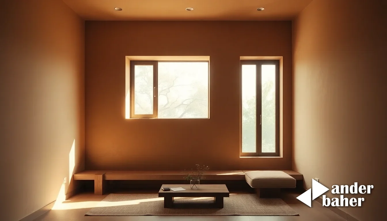
Walk into a small home where the interior designer has chosen to reveal rather than conceal. You notice immediately: the depth of a wall. Not its thickness in millimetres, but its presence as a thing—as material, as craft, as a surface that catches light differently depending on angle and time. This is the opposite of the contemporary impulse to erase all evidence of construction, to render walls as invisible planes.
In Indian homes, we have long understood this intuitively. A lime-rendered wall in Kerala, left unhidden and celebrated, ages beautifully. Exposed brick in a Mumbai loft tells a story about the building's past. Raw concrete in a Bangalore residence becomes textural, alive. Yet somewhere in the last decade, the tendency has been to cover, to flatten, to treat walls as mere backdrops to be painted white and forgotten.
There is another way—one that recognizes that constraining square footage need not constrain design ambition. When you work with modest dimensions, every decision becomes more charged. Material choice stops being decoration and becomes narrative.
Materiality as Space-Making
Consider how a single material—used honestly, without artifice—can expand perception of space. A textured plaster that catches afternoon sun creates visual depth that a smooth, glossy surface cannot. Stone or brick left raw demands attention, ownership. It makes the room feel less like a generic apartment and more like a specific place, a home with agency.
This is particularly relevant in Indian urban contexts, where apartments are often compact by design. Rather than fighting the constraint with visual tricks—mirrors, light colours, minimal furniture—what if the architecture itself provided the richness? A wall constructed in exposed brick, left to show its joints and variation, makes a 12-by-14-foot bedroom feel inhabited, not cramped.
Proportion and Proportion Alone
The second quiet tool is proportion. When space is limited, every vertical and horizontal relationship matters more. A ceiling height that breathes, a doorway width that feels generous rather than pinched, shelving that acknowledges the human scale—these aren't luxuries in small homes; they are necessities for livability. The mathematics of proportion cost nothing but thought.
Many Indian architects understand this instinctively: the way a verandah is dimensioned in older Chennai houses, the generous thresholds in traditional Tamil Nadu homes, the considered spacing of supporting columns in colonial bungalows. These weren't accidents. They were solutions to the problem of making modest dwellings feel complete.
The Quiet Luxury of Restraint
There is a luxury, finally, in restraint. In not filling every corner. In letting a wall be a wall. In choosing two materials instead of six. A small home designed with this discipline—where every surface has intention, where materiality is allowed to speak—becomes not a compromise but a conviction.
The homes that resonate, that age well, that feel genuinely lived-in: they are rarely the ones where the architect tried to create abundance through visual noise. They are the ones where limitation became clarity. Where walls were permitted to breathe.
Sources & further reading
- ArchDaily — Maribyrnong I House / Studio Ceravolo ↗
- ArchDaily — Hermitage House C70 / ASMD Taller Arquitectura ↗
- ArchDaily — C.E. House / Dall'Ovo Magalhães Arquitetura ↗
- ArchDaily — Breeze House / Ábaton ↗
An original Ander Baher perspective, informed by the coverage above.
Frequently asked
How can I make a small apartment feel larger without relying on mirrors and white walls?
Materiality—honest, textured surfaces like exposed brick or raw concrete—creates visual and spatial depth that tricks cannot. When materials are allowed to speak authentically, even compact rooms feel inhabited rather than constrained.
What role does proportion play in designing livable small homes?
Proportion is foundational: ceiling heights that breathe, generous doorway widths, and human-scaled shelving cost nothing but thought, yet transform how a modest space feels. Colonial and traditional Indian architecture demonstrates this principle elegantly.
Why should I avoid filling every corner of a small space with design elements?
Restraint is its own luxury. When every surface carries intention and materials are permitted to breathe, limitation becomes clarity—a small home designed with discipline ages beautifully and feels like genuine conviction, not compromise.
Ready to transform your space — inside or out?
Tell us a little about your home or office. We'll get back within one working day.
Book a consultation