
Magazine › Interiors
The Intentional Blur: Softness as a Radical Design Move for Indian Interiors
Precision isn't always clarity. How deliberate softness and low-resolution aesthetics challenge the tyranny of crisp, controlled interiors in Indian homes.
By the Ander Baher Editorial Desk · 15 October 2026
When Precision Becomes Prison
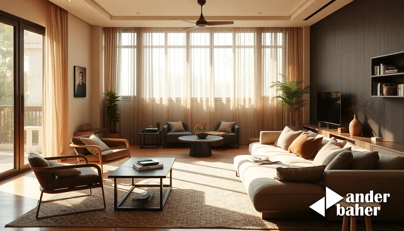
Walk into a newly-completed high-rise in Devanahalli or Sarjapur Road, and the first thing you encounter is clarity—sharp edges, crisply defined surfaces, the architectural equivalent of a high-resolution photograph. Every plane is flat, every corner is ninety degrees, every material is visually legible from across the room. It is, by conventional standards, immaculate. It is also, often, exhausting.
There is a growing undercurrent in thoughtful interior design that challenges this precision-obsessed worldview. Not through sloppiness or carelessness, but through deliberate softness—edges that blur, surfaces that suggest rather than declare, materials that resist the flattening gaze of the photograph. This is not a return to ornament or clutter. It is something more interesting: an argument that reduction and softness are not opposites, but intimate allies.
In the context of Indian homes—where monsoon damp, harsh afternoon sun, and the sensory chaos of urban density already compromise our desire for control—this shift feels less like a trend and more like an admission. An admission that clarity is not the same as calm, and that sometimes, the most intentional design move is to let the edges go soft.
Softness as Resistance
The impulse toward blurred, low-resolution forms is fundamentally a resistance to the perfection imperative. In a world where every interior is documented, filtered, and Instagram-optimized, where the digital image has become the primary measure of a room's success, there is a quiet radicalism in making something that doesn't photograph sharply. A form that resists legibility. A surface that requires presence, not just observation.
In Mumbai's established neighbourhoods—Bandra West, Lower Parel, Worli—and in Bengaluru's premium corridors like Whitefield and Yelahanka, we are seeing newly-handed-over apartments with increasingly sophisticated owners who understand this distinction. They do not want their interiors to look like renderings. They want them to feel alive, unfixed, capable of changing meaning depending on light, time of day, and the mood they bring to the room.
Softness achieves this because it is temporally active. A sharp edge looks the same at noon and at dusk. A blurred threshold, a fabric that catches light unevenly, an upholstered form whose contours shift with shadow—these breathe with the day.
Materials That Refuse Definition
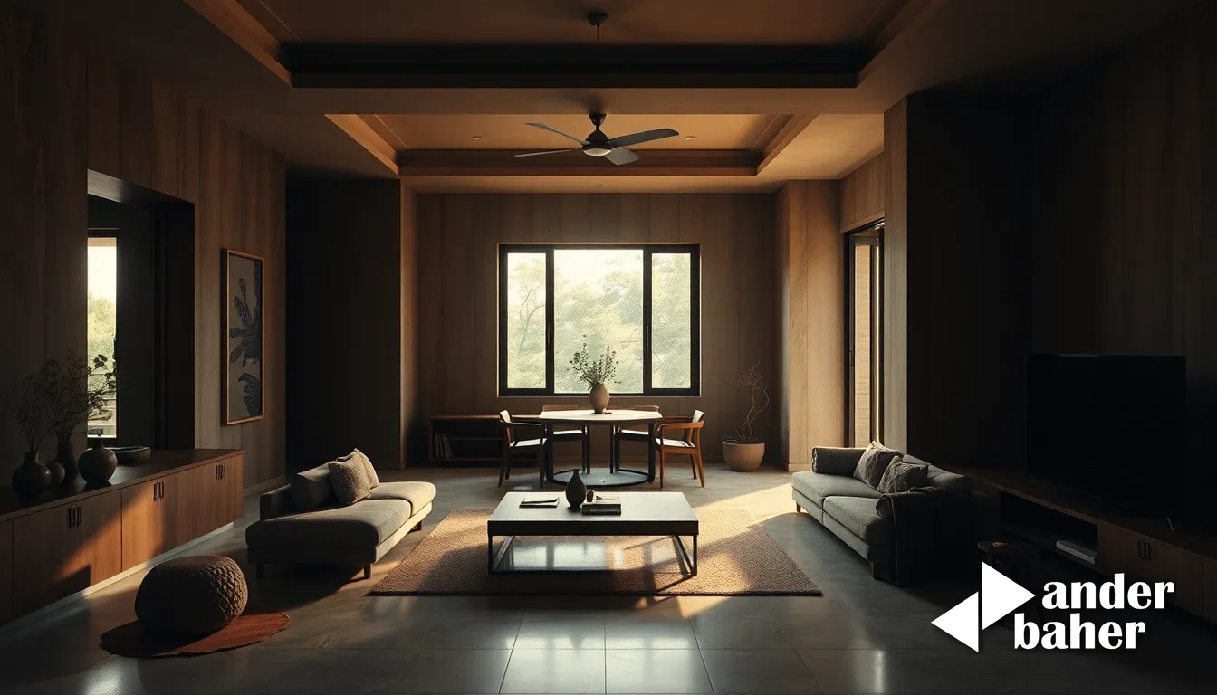
In practice, this means rethinking materiality. Conventional interior design reaches for materials with high definition: polished stone, lacquered wood, brushed metal—surfaces that announce themselves. The alternative is to work with materials whose boundaries are inherently soft: layered textiles, unsealed natural materials, plaster that accepts wear, stone whose surface is matt and imprecise.
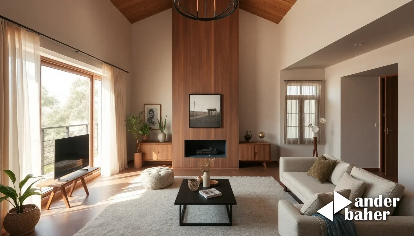
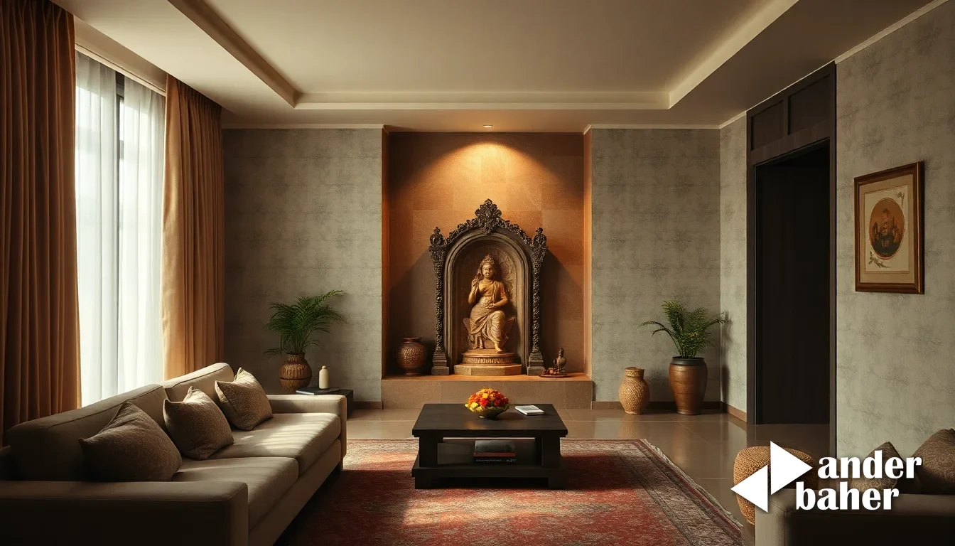
Consider a living room in a just-completed tower in Sarjapur Road. Rather than specifying a high-gloss accent wall or a dramatic marble feature, the more interesting move is to introduce a wall of matte plaster, handtroweled to capture texture without delivering visual sharpness. Or to choose upholstered forms—a low seating volume, a corner element—whose edges are soft and enveloping rather than geometrically crisp. The room becomes less a stage set and more a space you inhabit.
This approach also responds to India's climate in ways that sharp-edged design does not. Monsoon damp softens the edges of paint finishes and plaster. Harsh summer sun bleaches colour into something more diffuse. Cross-ventilation moves fabrics and light in unpredictable ways. Rather than fighting these conditions with precision and sealants, what if we designed with them? What if we embraced the blur as a feature, not a problem?
The Threshold Reimagined
One of the most practical applications of this philosophy is in the design of thresholds—the passages between rooms, the edges of balconies, the transition from living space to private quarters. In conventional design, these are sharp: a clear wall line, a defined doorway, a precise balustrade. In a softness-first approach, thresholds become liminal. A sliding screen in layered cotton filters light without excluding it. Soft upholstered bench seating blurs the line between seating and threshold. Planting or landscape elements (which our integrated interior and landscape practice often handles in concert) soften the visual handover between inside and outside, creating what architects call "permeable boundaries."
This is especially relevant for balcony and terrace spaces in Mumbai and Bengaluru, where monsoon waterproofing and sun control are practical necessities. Rather than installing a hard awning or a rigid screen, consider soft fabric elements, layered plantings, or materiality that accepts weathering as part of its aesthetic contract. The result is a space that feels designed yet alive—not a sealed interior extended outward, but a genuine threshold.
Softness and Silence
There is also an acoustic dimension to this work that bears mentioning. Sharp, hard surfaces—polished concrete, glass, metal—amplify and reflect sound. Soft materials—plaster, textiles, natural timber, layered fabrics—absorb it. In the dense, noise-saturated context of Indian cities, where the sound of traffic, construction, and urban life presses constantly against the walls of our homes, softness becomes an act of acoustic generosity. A room designed with soft materials is quieter, more forgiving, less fatiguing. It allows for silence in a way that a sharp, high-definition interior does not.
This is not minimalism in the conventional sense—the reduction of object count and the pursuit of emptiness. This is minimalism in service of something deeper: the creation of space where attention can rest, where the eye is not constantly snagged by hard edges and high contrast, where the room itself becomes a form of background, a canvas for the small, beautiful, intentional things you choose to place within it.
The next time you step into a newly-handed-over apartment or consider a renovation, resist the temptation to sharpen everything into place. Ask instead: What if this threshold were softer? What if this wall didn't demand such clarity? What if this material were allowed to age, to blur, to become less legible over time? These are the questions that separate interiors that impress from interiors that settle into your life. Explore our delivered spaces to see how intentional softness and blurred edges shape presence, or generate conceptual ideas for your own space using our design tools.
Sources & further reading
- Dezeen — Jonas Hejduk's blurry furnishings are deliberately low resolution ↗
- designboom — crafted from dual-tone solid oak, TUPI lamp by estudio gris resembles bird at rest ↗
- designboom — moyo shirt jacket weaves korean hanbok silhouette with east african kitenge textile ↗
- Dezeen — Recycled-plastic plinths hold furniture at "secret" Barragán house in Mexico City ↗
An original Ander Baher perspective, informed by the coverage above.
Frequently asked
Won't soft, blurred edges and matte finishes look unfinished or neglected?
Only if the softness is accidental. Intentional softness—a hand-troweled plaster wall, carefully chosen natural textiles, layered materiality—requires as much precision in design and execution as sharp-edged interiors. The difference is that the precision serves presence and tactile experience, not visual legibility.
How does softness work practically in Indian homes, where monsoon and dust are real concerns?
Softness is not delicacy. Natural, unfussy materials—unsealed plaster, natural fibres, timber—age beautifully and respond gracefully to climate stress. By designing with the climate rather than against it, soft-edged interiors often require less maintenance than the sealed, sharp-edged alternatives.
Is this approach suitable for smaller apartments in Mumbai or Bengaluru high-rises?
Absolutely. In fact, softness is often more effective in compact spaces than sharp geometric precision. By avoiding high contrast and hard edges, soft interiors feel less visually demanding and make compact rooms feel more generous and livable.
Ready to transform your space — inside or out?
Tell us a little about your home or office. We'll get back within one working day.
Book a consultation